Now, in web, d3 & nvd3 has been the first option for graph rendering(maybe not…but I think so) in open source projects. And one of them, line chart, are being used to show the movement of some value by timeline.
But when using on this, there are some parts, that makes this tool untidy.
Codes are worked with angular-nvd3(1.0.8).
{% highlight html %}
{% raw %}
…
{% endraw %} {% endhighlight %}
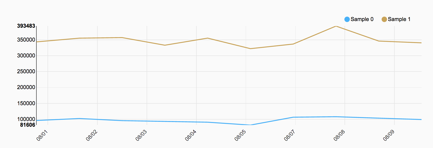
This is simple example for daily line chart, and here is the result with 2 datasets.

It looks clean, but there are some problem.

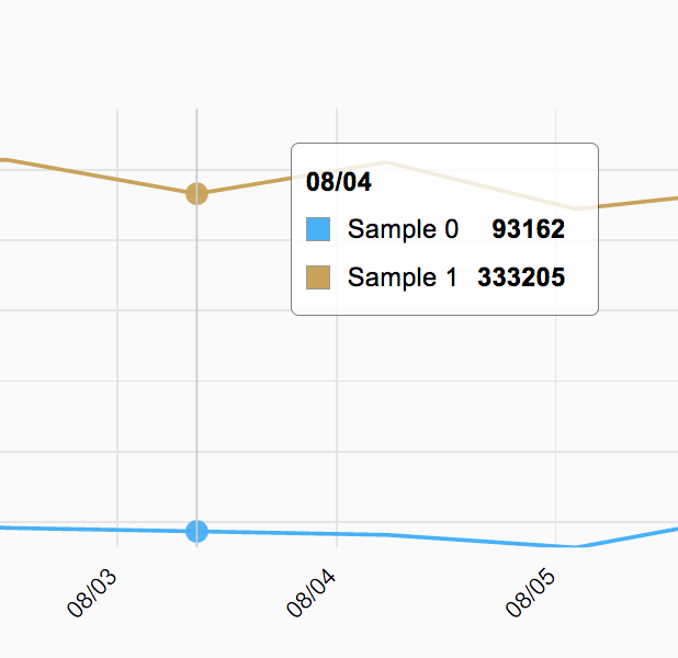
Like this, grid on graph(which are being called tick) and guideline are not matching. The reason is that in nvd3, distance of each grid line are changing dynamically, depends on width of rendering area. In my case, input comes as unix timestamp value, and reformed by d3.time.format(). Distance of timestamp value are always fixed(in my case, it is 86400000) but grids are not.
To avoid this, you need to customize tick value.
{% highlight javascript %} {% raw %} … vm.graph_option = { chart: { type: ’lineChart’, height: 300,
    xAxis: {
        axisLabel: 'Date',
        tickFormat: function(d) {
            return d3.time.format('%m/%d')(new Date(d));
        },
        tickValues: function(values) {
            return _.map(values[0].values, function(v) {
                return new Date(v.graph_date);
            });
        },

        rotateLabels: -45,
        showMaxMin: true
    },

    interpolate: 'linear',
}
}; … {% endraw %} {% endhighlight %}
Override tickValues and return map data. It will fix grid with guideline.

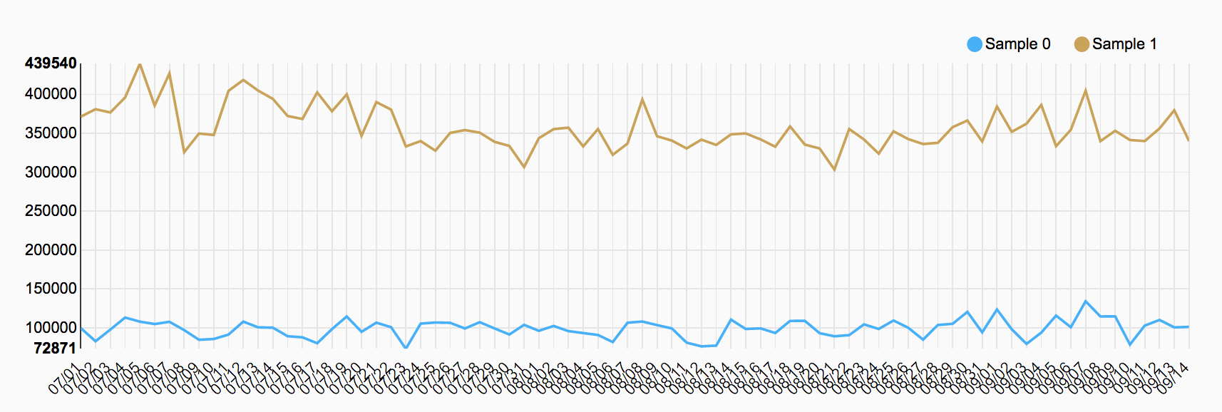
This looks clear, but now grid value and range are being locked up, and will show another problem.

Because of range value are fixed, it will show all grids though total range becomes very large. You need additional work for this.
{% highlight javascript %} {% raw %} … vm.tick_list = [];
vm.graph_data = function() { … var graph_data = []; var need_custom_tick = (total_data.length > 5); var tickRange = 1;
if(need_custom_tick)
    tickRange = Math.round(total_data.length / 5);

for (var i = 0; i < total_data.length; i++) {
    graph_data.push({
        graph_date: moment(total_data[i]).valueOf(),
    });

    if(i % tickRange == 0)
        vm.tick_list.push(moment(total_data[i]).valueOf());
}
...
} … vm.graph_option = { chart: { type: ’lineChart’, height: 300,
    xAxis: {
        axisLabel: 'Date',
        tickFormat: function(d) {
            return d3.time.format('%m/%d')(new Date(d));
        },
        tickValues: function(values) {
            return _.map(values[0].values, function(v) {
              if(vm.tick_list.includes(v.graph_date)) {
                  return new Date(v.graph_date);
              } else {
                  return '';
              }
            });
        },

        rotateLabels: -45,
        showMaxMin: true
    },

    interpolate: 'linear',
}
}; … {% endraw %} {% endhighlight %}
I made custom tick range when registering graph data. As you can see in ‘vm.graph_data’ function, it shows all values when there are 5 or less data(this is just temporarily definition) and add custom tick value when there are more than this. These ticks divides the range into 5. Now in ’tickValues’ option, return proper date value only for this value.

As you can find out, this process cannot divide all range equally. But anyway it cannot make same range value for all distance as you want to make all tick match with guideline. Though you can make closely equal with more work, and hope this could be help to someone.