kaggle is a platform for competiting data analytic and predictive modeling. Lots of companies post their raw data, and researchers compete to find best prediction from here. You can use Python, R, or Julia for a research. I’ll work on with Python here.
Each researched records are managed as kernel, and you can make your own or look on other user’s data.

Titanic research
 This is one of most famous topic in data research, and
 kaggle suggest this as tutorial for kaggle platform, and data research. I’ll not explain in detail about Titanic cause it is most infamous disasters and all of you will know about this very well.
In this research, given data is list of passengers and crew, and informations of them like age, embarked, sex, and more. Goal of this analysis is to find out what sort of people were likely to survive.
If you are first in data research so don’t know how to start on, you can refer other people’s kernel. Some of good kernels are commented very well to look and follow up how they work on. Or you can just look through blog posts in Google about ‘Titanic data research’ cause it is very popular tutorial. Also I’m a starter in this field, I followed research tutorial in Datacamp, and public notebooks of other great engineers.
Look on data, and startup your notebook
First thing you have to do when face on dataset, is to read and find out what is in it.
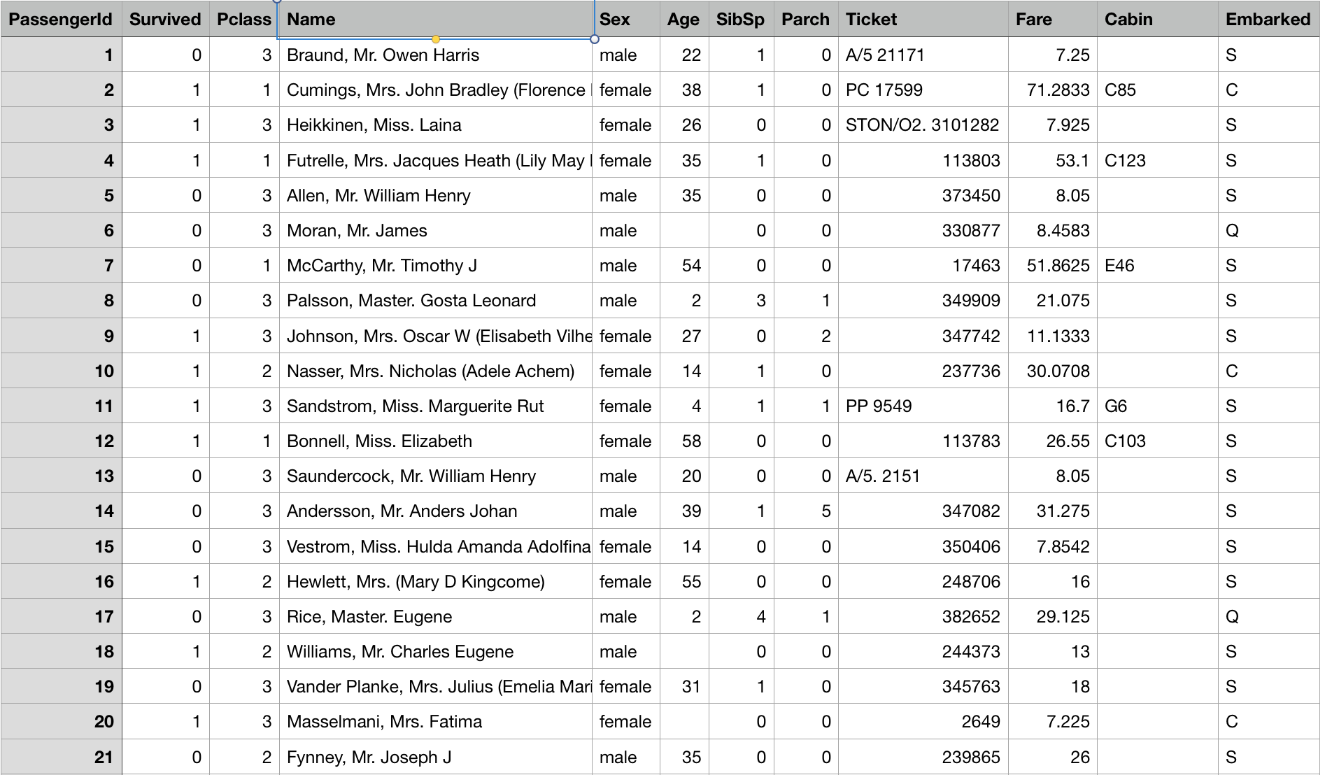
This is the given data, which you need to research on. Each of column means…
survivalSurvival 0 = No, 1 = YespclassTicket class 1 = 1st, 2 = 2nd, 3 = 3rdsexSexAgeAge in yearssibsp# of siblings / spouses aboard the Titanicparch# of parents / children aboard the TitanicticketTicket numberfarePassenger farecabinCabin numberembarkedPort of Embarkation C = Cherbourg, Q = Queenstown, S = Southampton
There are 2 given files. train.csv is for training, and you need to create research model based on this. test.csv is a data you need to predict survivers with your model, so there is no survival column here.
Now when you create new notebook for research, you would find default code already been set.
{% highlight python %} {% raw %}
This Python 3 environment comes with many helpful analytics libraries installed
It is defined by the kaggle/python docker image: https://github.com/kaggle/docker-python
For example, here’s several helpful packages to load in
import numpy as np # linear algebra import pandas as pd # data processing, CSV file I/O (e.g. pd.read_csv)
Input data files are available in the “../input/” directory.
For example, running this (by clicking run or pressing Shift+Enter) will list the files in the input directory
from subprocess import check_output print(check_output([“ls”, “../input”]).decode(“utf8”)) {% endraw %} {% endhighlight %}
This code first imports the basic module for data research. Most of the Python user would need numpy and pandas for calculation, data process, and data I/O(maybe someone should not, but I cannot expect). Second, it shows the path of data file is in ‘../input’ directory. So we could import and check the data like
{% highlight python %} {% raw %} train_df = pd.read_csv(’../input/train.csv’) # training dataframe test_df = pd.read_csv(’../input/test.csv’) # test dataframe train_df.head() {% endraw %} {% endhighlight %}
Visualize dataset
Now the data is set in pandas Dataframe. It makes more simple to use plot modules for visualization, such as matplotlib, seaborn, bokeh, and other. To see the precise data, it would be good to see it as numbers in table. But to compare multiple parameter and look on data approximatively, make the data in chart would reduce your headache.
{% highlight python %} {% raw %}
visualization
import seaborn as sns import matplotlib.pyplot as plt
f, ax=plt.subplots(1, 2, figsize=(18,8)) train_df[‘Survived’].value_counts().plot.pie(explode=[0,0.1],autopct=’%1.1f%%’,ax=ax[0],shadow=True) ax[0].set_title(‘Survived’) ax[0].set_ylabel(’’) sns.countplot(‘Survived’,data=train_df,ax=ax[1]) ax[1].set_title(‘Survived’) plt.show() {% endraw %} {% endhighlight %}
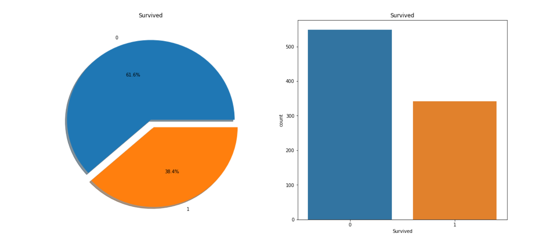
This is the chart which compares the survivals and deads. You can clearly see it that more than twice of survival people are dead.
{% highlight python %} {% raw %} f, ax = plt.subplots(1, 2, figsize=(18, 8)) train_df[‘Survived’][train_df[‘Sex’]==‘male’].value_counts().plot.pie(explode=[0,0.1],autopct=’%1.1f%%’,ax=ax[0],shadow=True) train_df[‘Survived’][train_df[‘Sex’]==‘female’].value_counts().plot.pie(explode=[0,0.1],autopct=’%1.1f%%’,ax=ax[1],shadow=True) ax[0].set_title(‘Survived (male)’) ax[1].set_title(‘Survived (female)’)
plt.show() {% endraw %} {% endhighlight %}
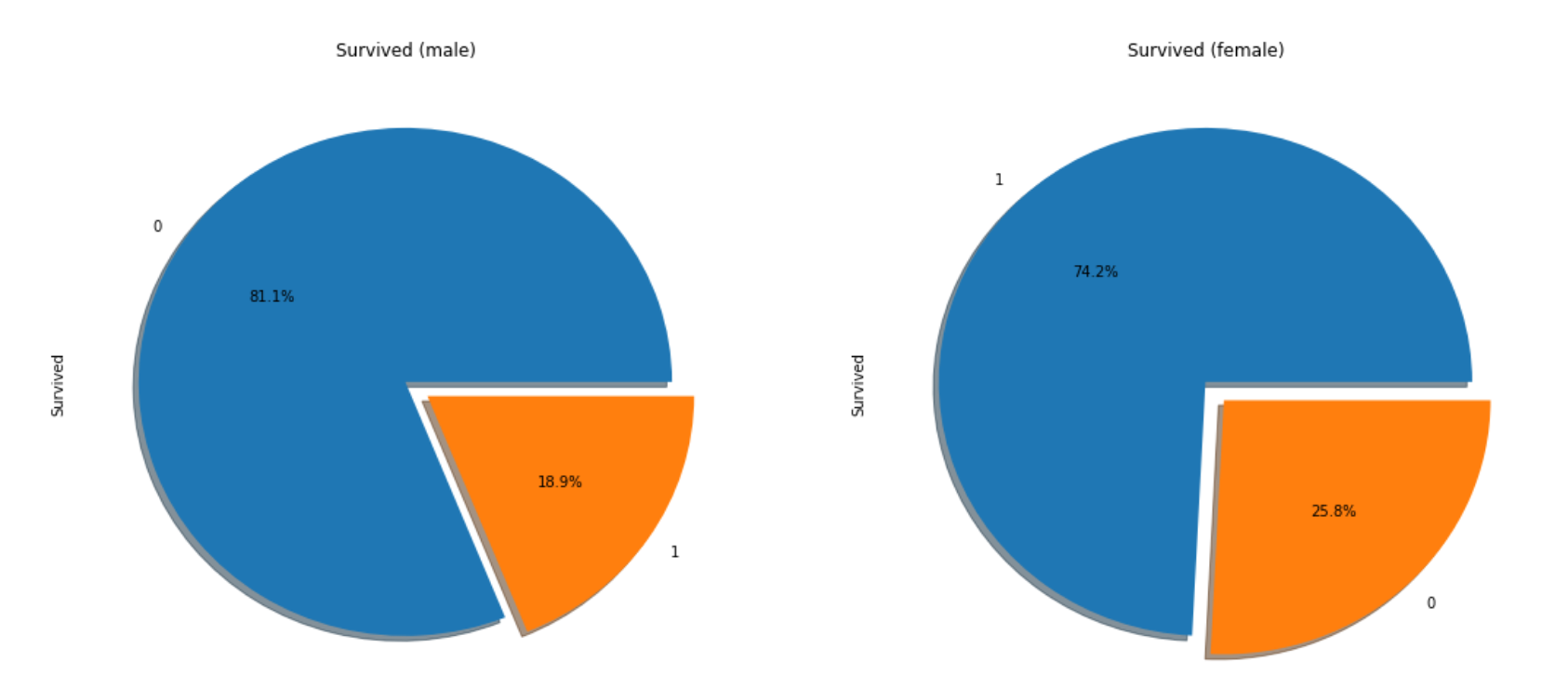
This compares the survivals by Sex, and you can find out survival rate of female is much higher than man(almost 3 times more!).
{% highlight python %} {% raw %} pd.crosstab([train_df[‘Sex’],train_df[‘Survived’]],train_df[‘Pclass’],margins=True).style.background_gradient(cmap=‘summer_r’) {% endraw %} {% endhighlight %}
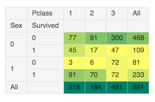
This is the table which shows the number of survived and dead by Sex, Pclass. This is bit hard to look on, but you can figure out that passenger in higher class are more survived.
{% highlight python %} {% raw %} f, ax = plt.subplots(2, 2, figsize=(20,15)) sns.countplot(‘Embarked’, data=train_df,ax=ax[0,0]) ax[0,0].set_title(‘No. Of Passengers Boarded’) sns.countplot(‘Embarked’,hue=‘Sex’,data=train_df,ax=ax[0,1]) ax[0,1].set_title(‘Male-Female Split for Embarked’) sns.countplot(‘Embarked’,hue=‘Survived’,data=train_df,ax=ax[1,0]) ax[1,0].set_title(‘Embarked vs Survived’) sns.countplot(‘Embarked’,hue=‘Pclass’,data=train_df,ax=ax[1,1]) ax[1,1].set_title(‘Embarked vs Pclass’) plt.show() {% endraw %} {% endhighlight %}
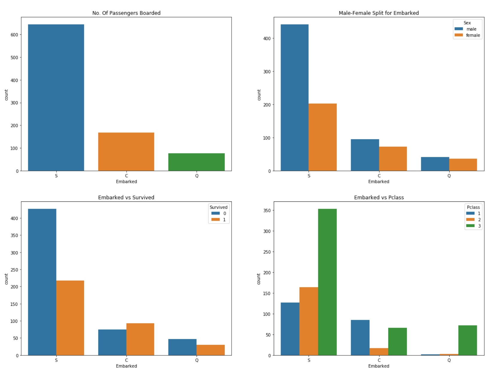
This shows the passenger data based on where they aboard on. Based on chart, more than half of people came in from S(Southampton), and rate of 1st class passenger from C(Cherbourg) is higher than other port.
Like this, making data as chart or table helps overviewing on data, and compare each columns.
Simple pre-processing
Now, I’ll try to make a simple data model with these information(Sex, Pclass, Embarked). There are other more columns in the table, but others are not good to use without data clensing.
Most ‘pure’ datasets are not good to use directly. There are lots of missing/noisy data, outlier, duplicated value. Also, to make data more useful, it needs to be reduce, and grouped. This process is called Data pre-processing. To explain this will be very long story, so I’ll try to show more about this in next post.
This time, I’ll just fill in the missing value because you could not generate model with this.
{% highlight python %} {% raw %}
show numbers of nulls in each column
train_df.isnull().sum() {% endraw %} {% endhighlight %}
{% highlight shell %} {% raw %} PassengerId 0 Survived 0 Pclass 0 Name 0 Sex 0 Age 177 SibSp 0 Parch 0 Ticket 0 Fare 0 Cabin 687 Embarked 2 dtype: int64 {% endraw %} {% endhighlight %}
There are 2 nulls in Embarked, so I’ll fill this with S because more than half of the current passenger has S. Actually you need lots of research to estimate missing value, but I’ll do it in simple way cause this is not the main story.
{% highlight python %} {% raw %} train_df[‘Embarked’].fillna(‘S’,inplace=True) {% endraw %} {% endhighlight %}
Now it is ready.
Generate data model, and predict the result.
I will generate data model via DecisionTree algorithm with ‘Pclass/Sex/Embarked’, which is in scikit-learn module. I’ll split train data by 7:3, create model with 7 and check the result with other 3.
{% highlight python %} {% raw %} from sklearn.tree import DecisionTreeClassifier from sklearn.model_selection import train_test_split from sklearn import metrics #accuracy measure
train, test = train_test_split(train_df, test_size=0.3,random_state=0) target_col = [‘Pclass’, ‘Sex’, ‘Embarked’]
train_X=train[target_col] train_Y=train[‘Survived’] test_X=test[target_col] test_Y=test[‘Survived’]
features_one = train_X.values target = train_Y.values
tree_model = DecisionTreeClassifier() tree_model.fit(features_one, target) dt_prediction = tree_model.predict(test_X)
print(‘The accuracy of the Decision Tree is’,metrics.accuracy_score(dt_prediction, test_Y)) {% endraw %} {% endhighlight %}
Data model is created as tree_model, and predict accuracy of splited data and predicted result from this model shows ‘0.809701492537’.
To generate the data for competition, you need to follow the format which they suggest. In this competition, it requires to create a csv file format with 2 columns, PassengerID and Survived. PassengerID is the ID of passengers in test.csv, and Survived is where you need to put in your predict result from data model.
{% highlight python %} {% raw %}
predict test data with pre-trained tree model
test_features = test_df[target_col].values dt_prediction_result = tree_model.predict(test_features)
Create a data frame with two columns: PassengerId & Survived. Survived contains your predictions
PassengerId = np.array(test_df[“PassengerId”]).astype(int) dt_solution = pd.DataFrame(dt_prediction_result, PassengerId, columns = [“Survived”])
Write your solution to a csv file with the name my_solution.csv
dt_solution.to_csv(“my_solution_one.csv”, index_label = [“PassengerId”]) {% endraw %} {% endhighlight %}
It’s done. Publish your notebook with this code, and it will generate my_solution_one.csv file. If it causes no error and format is correct, you will see a new column output in competition menu. Go in, and you will find your generated file there. Submit this for join in competition.
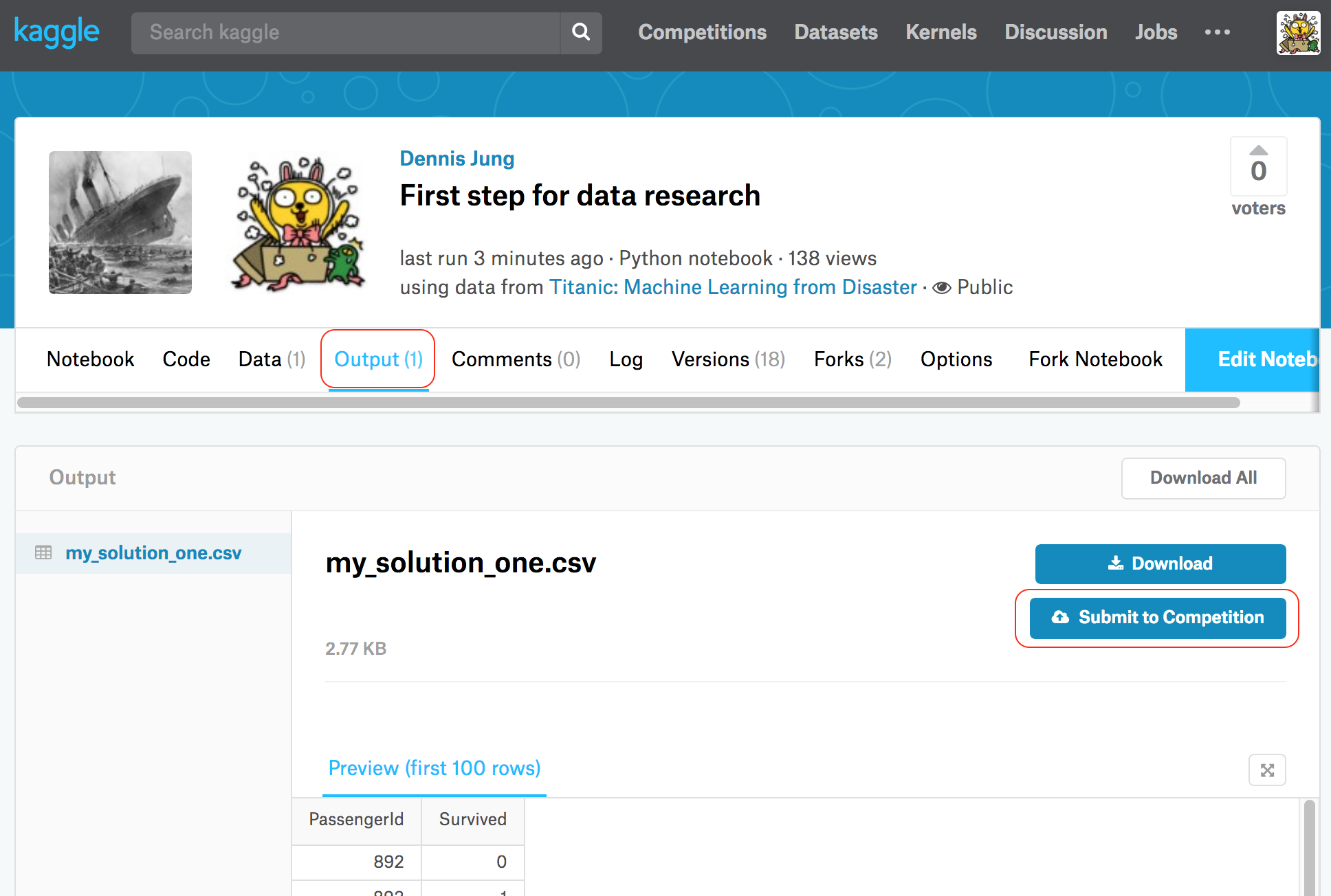
Now it will check your file, and show the score and rank.
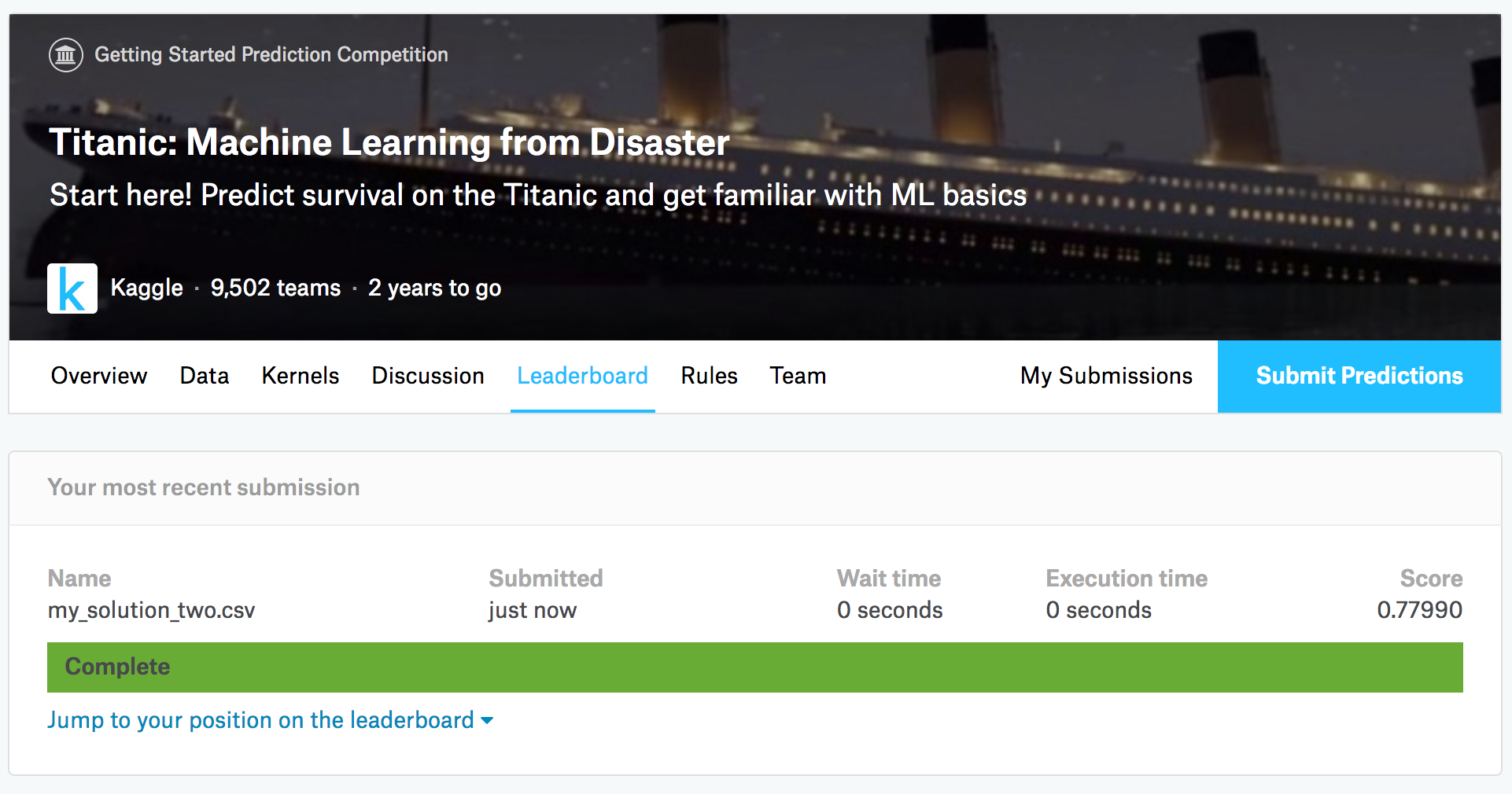
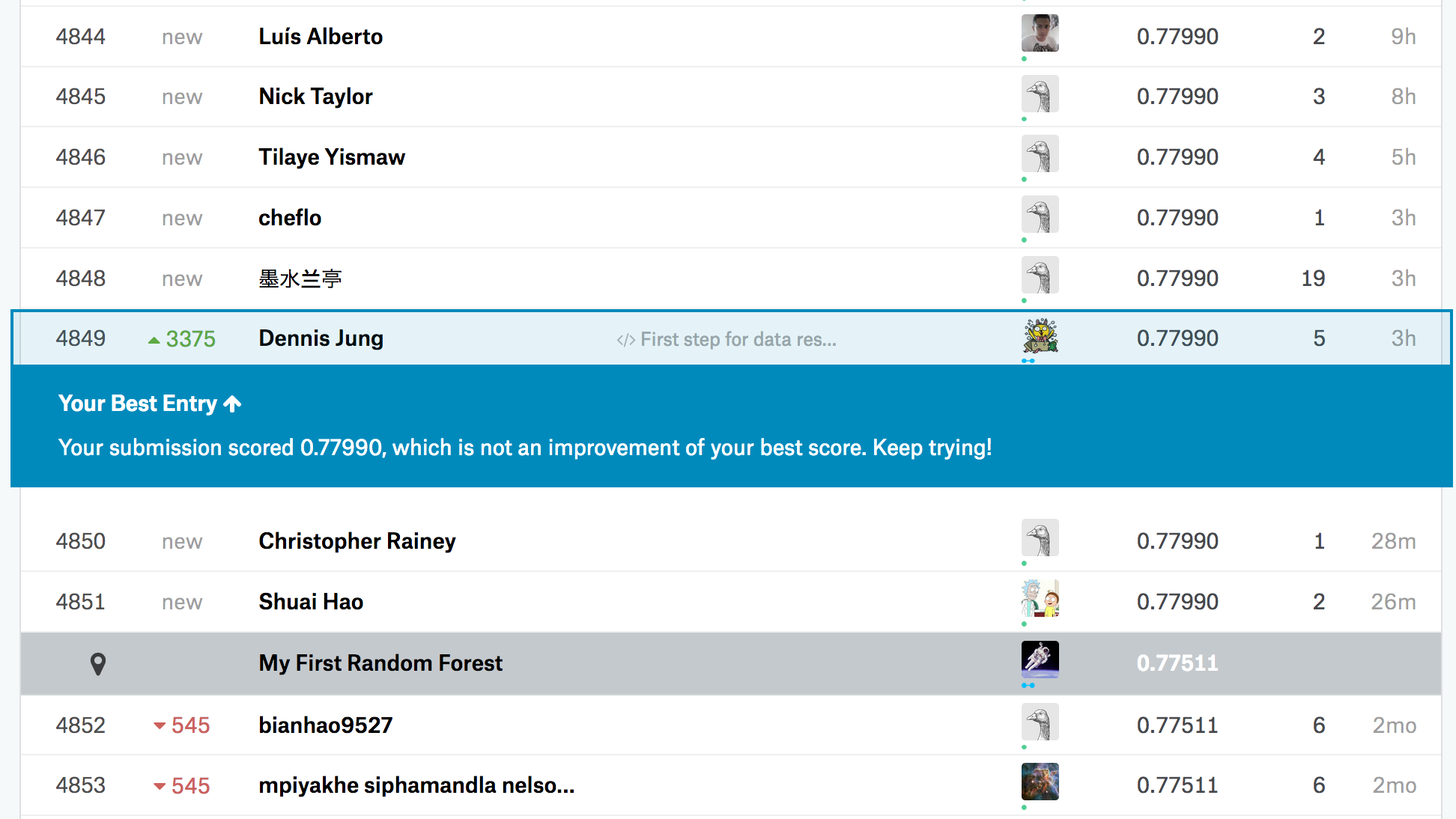
Well, I’m still in rank 4849 with accuracy score 0.77990, but it is not important here. This is just for looking on how to join in Kaggle competition, and check the basic rule of researching given data here. There are some people who has accuracy score 1, but it is quite overfitted result so most of the people think it cannot be trusted.
This time, I focused only on introducing Kaggle, looking in data, and involving in competition. I’ll write on more about data pre-processing, and figure out other ways to improve data model.